KingHost
I designed the app that brings KingHost service management to mobile
Over 40% of KingHost customers were already using the control panel on their phones, but it had been designed for desktop. I researched what they used most and designed King App around it. Five months after the first research, the app was in the stores, and it has a 5-star rating.
- Client
- KingHost
- Role
- UX Researcher/Product Designer
- Period
- 2024–2025
- Responsibilities
- User research
- Documentation of flows and processes
- Low- and high-fidelity screens and prototypes
- Visual QA before and after development
- From research to the stores
- 5 months
- App store rating
- 5 stars
01 About the project
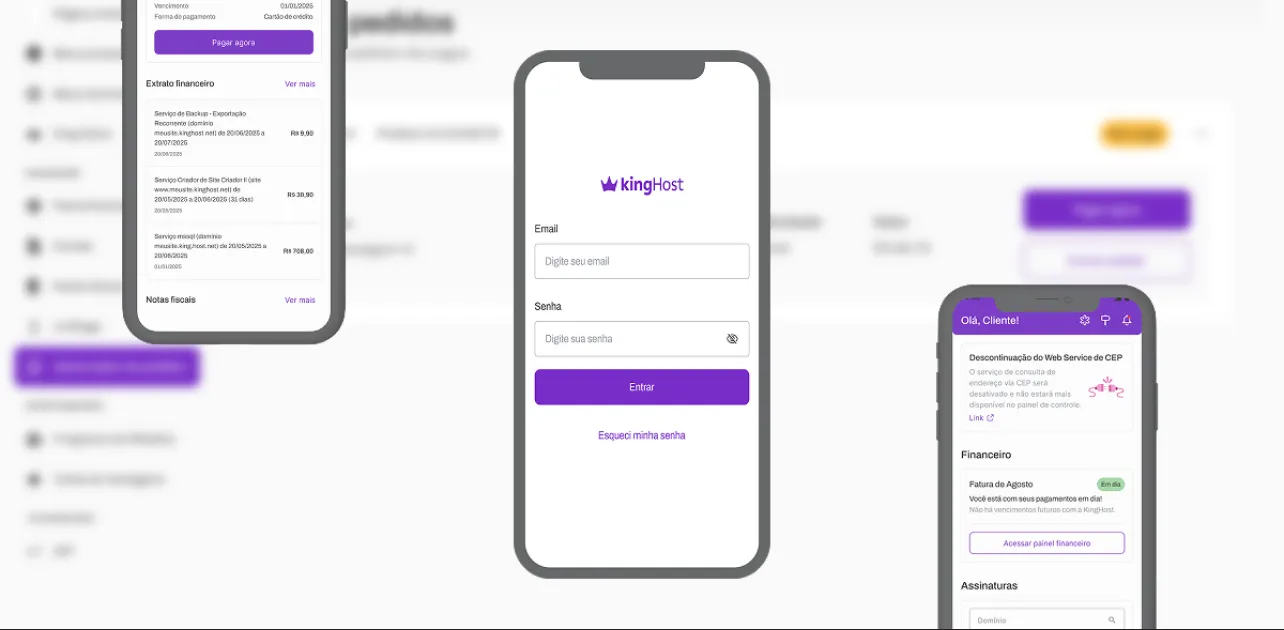
King App is the app KingHost customers use to manage their account and services from their phones. Before it, they did all of that in the control panel, which was designed for desktop.
02 Challenges
- A new Design System being built at the same time as the app
- Choosing which control panel features would make it into the app first
- A control panel designed for desktop that had to work on mobile
03 Project stages
Mapping the problem
In the months before the project, the design team started tracking a metric that stood out: mobile traffic kept growing. Since KingHost's products had always been designed for desktop, we started looking into building an app.
User research
To understand that shift, I ran two rounds of research, one quantitative (with numbers, to measure the behavior) and one qualitative (to understand the reasons). I wanted to know why customers were using their phones more, which features they used most and whether they'd want an app to manage their services.
Flows and blueprints
I started with the navigation inside each feature and how they connect to each other. That became the flows and the blueprints (maps of what happens on screen and behind it at each step).
Prototypes and usability testing
I built the prototypes in the order of relevance the research pointed to and ran usability tests (watching people use the prototype to see where they get stuck) with customers and with people inside the company.
Loading 
Home 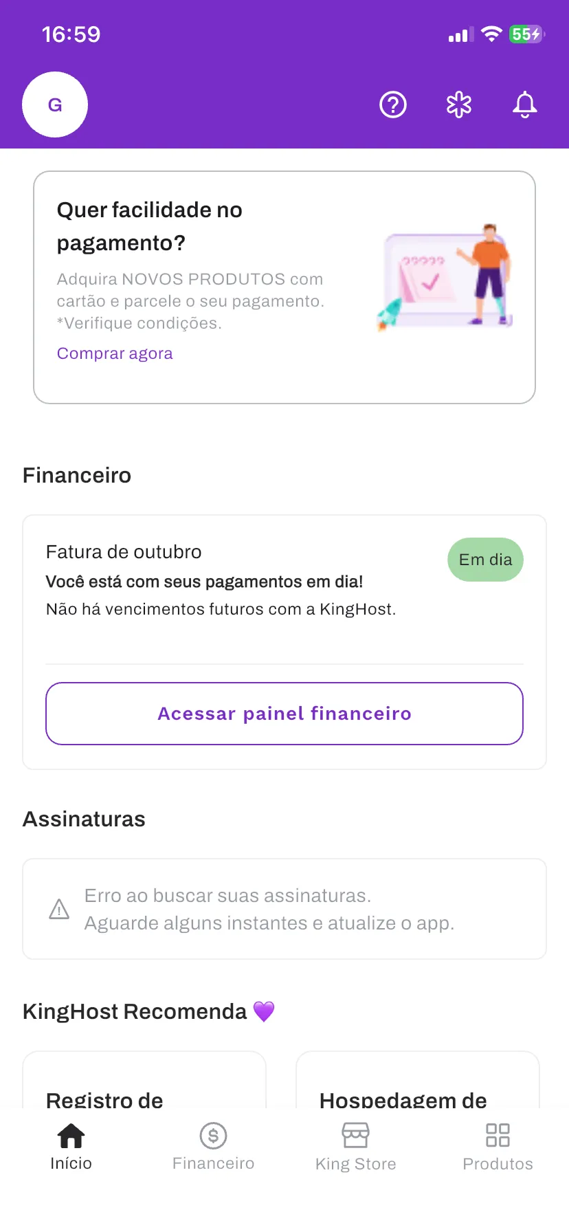
Billing 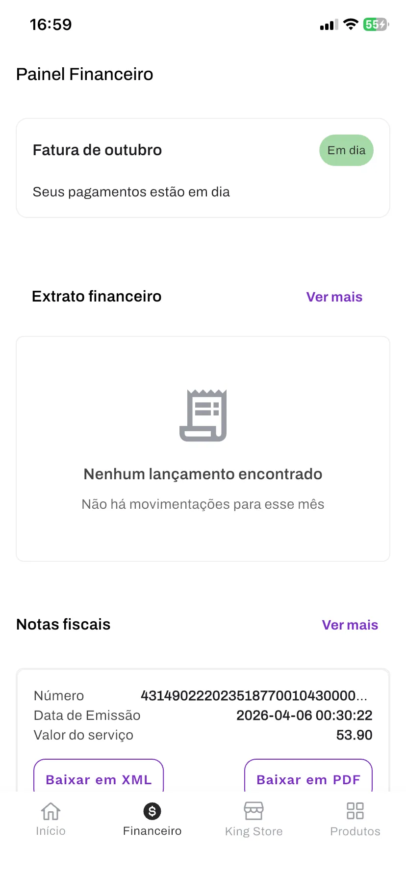
Products 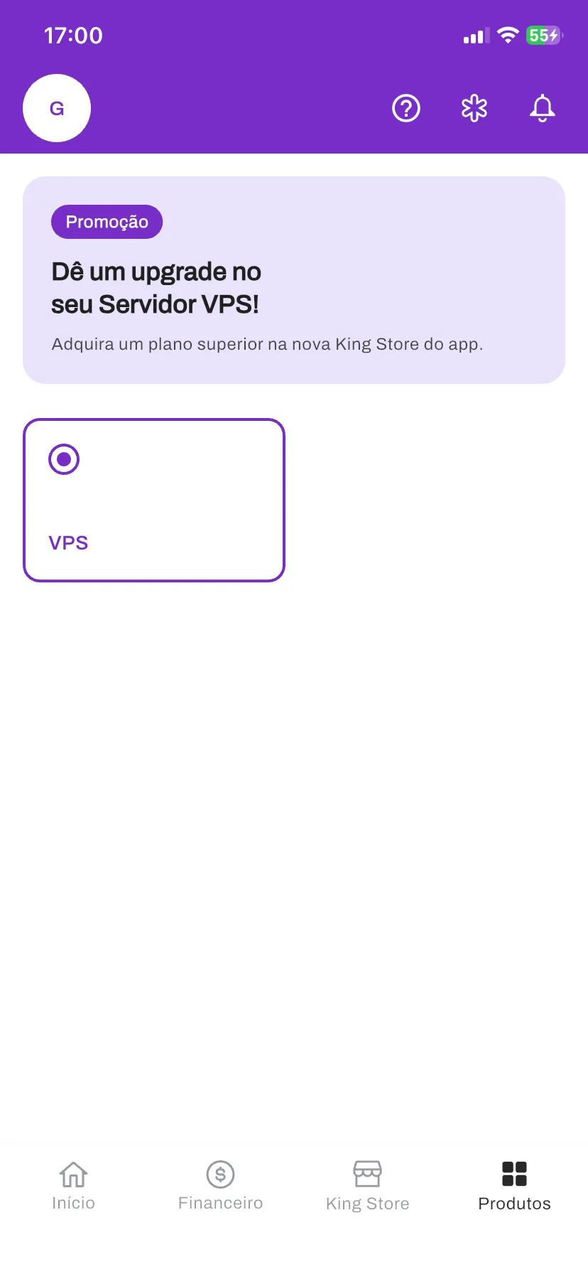
Help 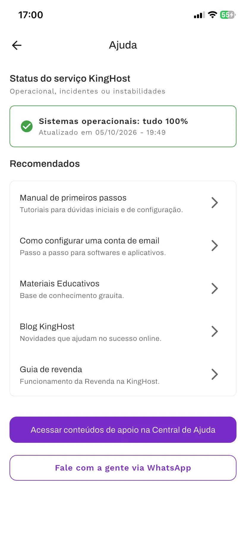
Account 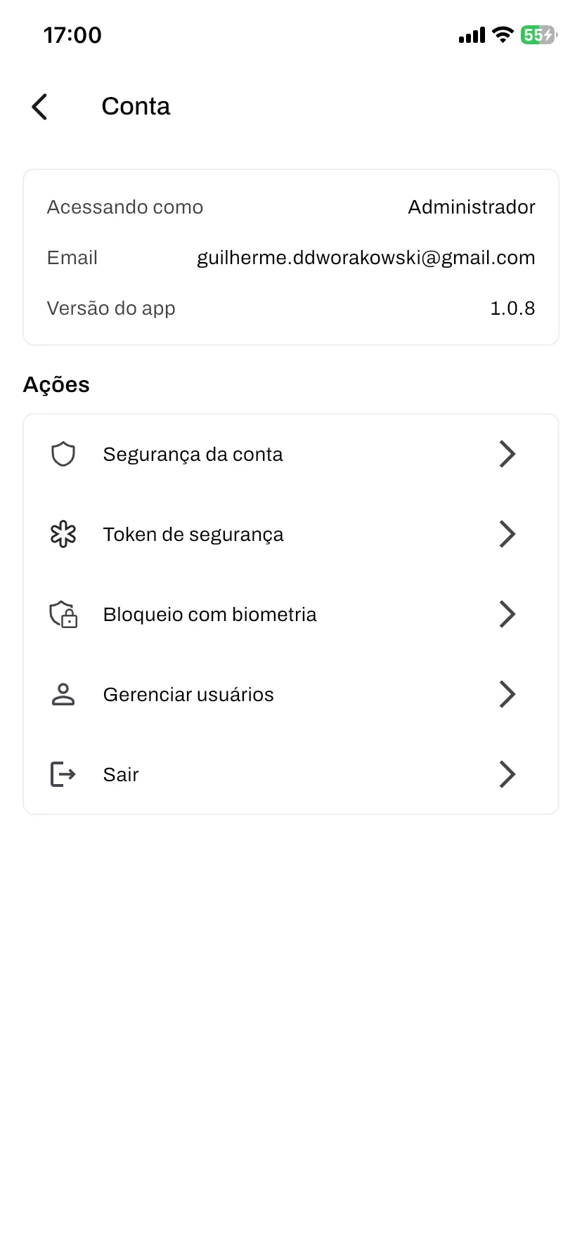
04 Findings
- Over 40% of customers were using the control panel on their phones. We saw it in Clarity and Hotjar (tools that show how people move around the screen).
- KingHost's products had never been designed for mobile. Until then, mobile work came down to responsiveness (adjusting the desktop screen to fit smaller ones).
- Customers said the control panel was hard to use in a mobile browser.
05 Decisions and trade-offs
- We started with the main screens: Home, Billing, Support and help, and Account.
- Those screens got the features customers used most: tracking the status of their products and servers, paying invoices, updating account details and contacting support.
- The rest of the control panel was left for later. In return, the app reached the stores in 5 months.
06 Highlights
It was the first service management app among Brazilian hosting companies. No other company offered anything like it at the time.
- From research to the stores
- From the first research (discovery) to the app being available in the app stores.
- App store rating
- Top rating in the app store reviews.
- Billing on mobile
- Billing was the feature customers wanted most. With it in the app, late payments went down.
Next case
Locaweb's Customer Center, where customers pay invoices, change plans and reach their other products. After the redesign, each action takes under 1 minute.